

The Psychology of Color in UX and Digital Products
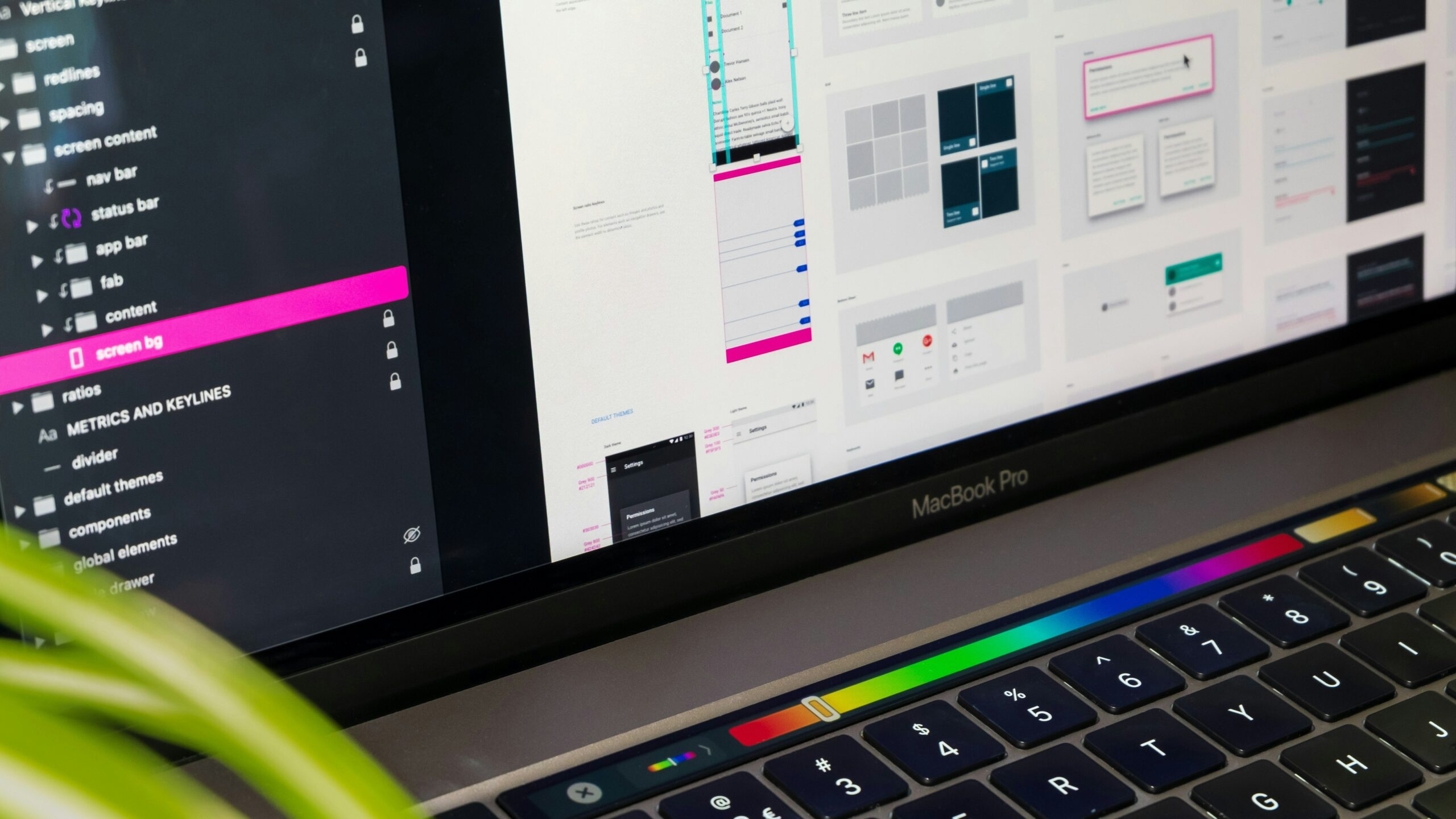
Creating a successful mobile application or a complex web platform requires much more than clean code. The ultimate success of your software depends heavily on how users react to its visual layout. In this competitive landscape, the psychology of color in UX serves as a vital tool for product designers and managers. Colors do not simply decorate a screen, but they actively shape subconscious emotions and guide human behavior.
How Colors Form User Decisions and Reactions
Every shade triggers an automatic and profound cognitive response in the human brain. For instance, blue is widely associated with security, trust, and corporate stability. As a result, fintech applications and advanced SaaS platforms frequently select this color for their interfaces. On the other hand, green naturally evokes feelings of health, sustainability, and dynamic business growth. Furthermore, vibrant red instantly captures attention and signals mistakes or urgent actions.
However, selecting your digital product palette should never be a random choice. A well-researched psychology of color in UX allows you to strategically manage the mood of your audience. Consequently, you can make your startup application look highly reliable or incredibly innovative. In addition, consistent color schemes significantly boost your brand recognition among corporate tech buyers. Modern users form opinions in milliseconds, making visual design a critical element of engagement.
Implementing the 60-30-10 Rule in Interface Design
When designing intuitive interfaces, global professionals always apply the famous 60-30-10 rule. According to this structural framework, 60% of the screen consists of the dominant, neutral background color. Next, 30% represents the secondary color, which builds the structural layout and elements. Finally, the remaining 10% belongs strictly to your accent color, reserved for critical Call to Action (CTA) buttons.
Consequently, the user instantly recognizes where to click without any extra cognitive effort. If your registration button visually pops out from the background, your user conversion rate increases. However, you must always maintain excellent color contrast for perfect readability. Poor text visibility will frustrate your clients and increase your platform bounce rates quickly. Therefore, digital accessibility has become a mandatory standard in modern product development.
Strategic Product Design for Scaling Your Tech Startup
In the modern technology sector, the first impression determines whether a digital product survives. Startups often build brilliant backend features but lose early users due to a confusing visual hierarchy. Because of this, implementing the psychology of color in UX remains essential for achieving product-market fit. The right colors keep users engaged and significantly reduce software abandonment rates.
When we develop new software products, we seamlessly combine aesthetics with technical performance. At Futurum Technology, we ensure that every design choice supports the strategic business goals of our partners. We build intuitive interfaces that not only look professional but also drive measurable conversion. Together, we can launch a digital product that connects perfectly with your target audience.

